

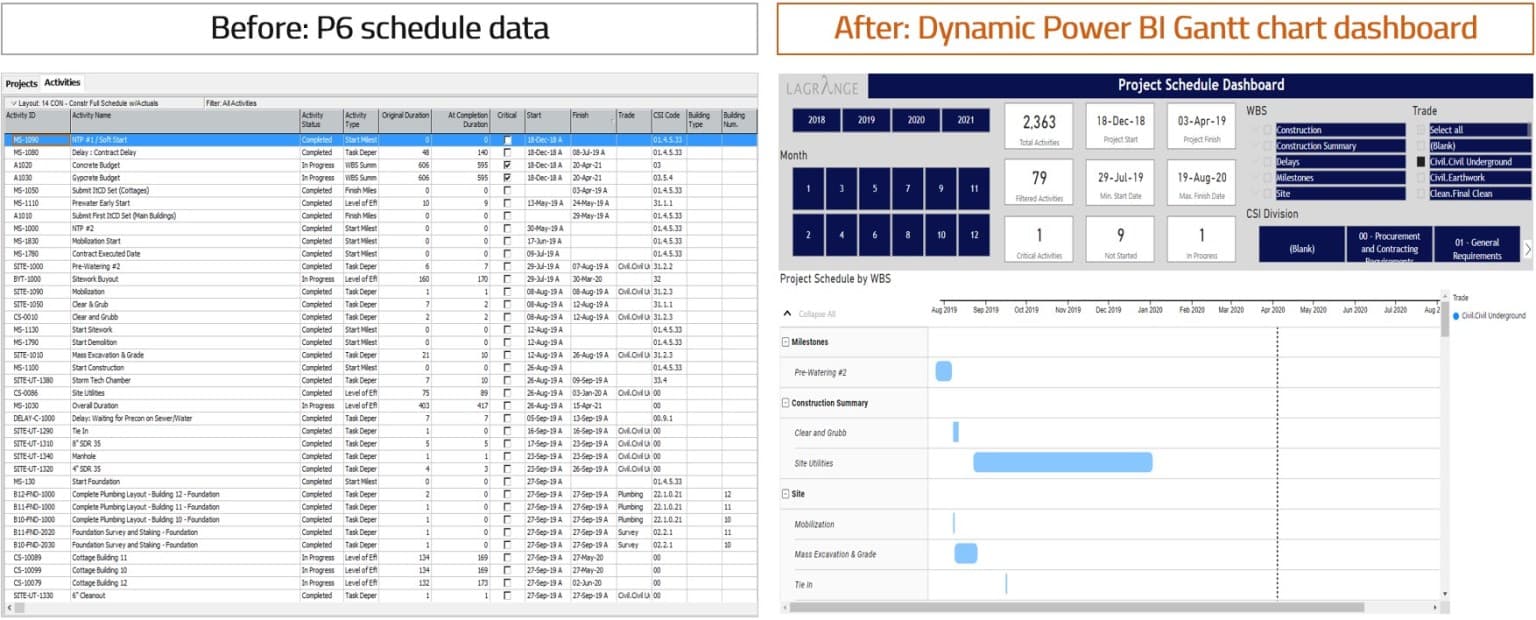
What is the most common way of looking at a construction schedule? Do you use a schedule dashboard or special schedule report?
For many, it usually involves going into Primavera P6 and adjusting groupings and applying filters (sometimes very lengthy and complex filters that become hard to follow). Once the set of activities are selected, a single view (layout) is generated and the schedule is printed to a PDF.
But what if you want to look at the schedule by the subcontractor? Or by area and trade?
In this post, I will show you how you can use the Gantt chart visual in Power BI to create a schedule dashboard and visualize schedule data from P6.
Using Power BI, you will be able to:
- Get schedule data from P6
- Create relationships among activities and activity codes
- Use the Gantt chart visual and create measures for simple schedule dashboard metrics
Taking P6 schedule data and making a dashboard in Power BI
If you are interested in learning various methods of obtaining your Primavera P6 data in Power BI (Excel, XML, XER, SQL), so that you can formulate your own schedule KPIs and develop an automated schedule dashboard, you may consider the hands-on online training organized by Project Control Academy; Power BI Visual Data Analytics for Project Controls.

Step 1: Getting schedule data from P6
The first thing we need is to get the schedule data from Primavera P6.
For this dashboard example, I utilized a construction schedule for an apartment project and selected some key data fields that will be helpful for our dashboard.
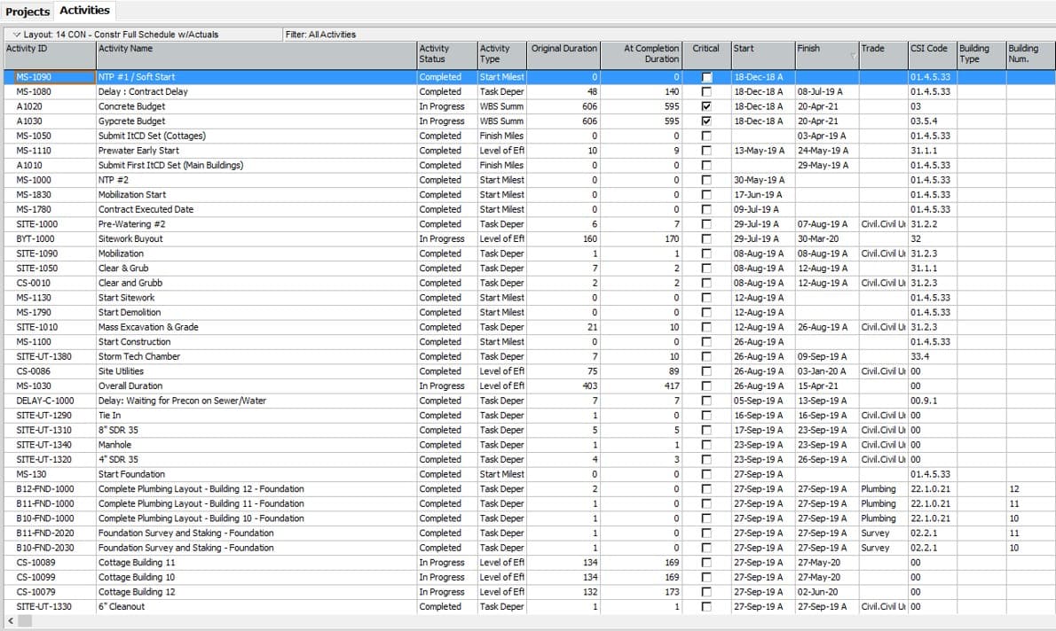
I selected all activities in P6 and pasted them into an Excel spreadsheet (Control A + Control C).
The next step was to clean the start and finish dates by removing the actuals (the “A” in the dates) and constraint marks (the “*” in the dates). There are a few different ways to remove the actuals and progress. You can remove the actuals and progress in Primavera P6 directly before copy and pasting the data to Excel. Check this blog post for the detailed process of how to do so.
I chose to use the Find and Replace tool in Excel after copying and pasting data into Excel.
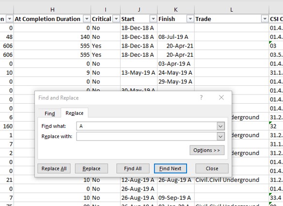
Find and replace the “A” in P6 dates
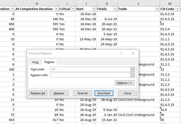
Find and replace the constraint marking “*” in P6 dates
The result in the start and finish date columns can be formatted as dates.
If the actual and constraint marks were not excluded, then Power BI would read the start and finish columns as text data and not allow for time intelligence analysis.
After saving and closing the Excel schedule data file, we open the Power BI Desktop and use the “Get Data” from Excel connection. From there, find the Excel file containing the schedule data, select the activities tab, and then hit “transform data” to go to the Query Editor.
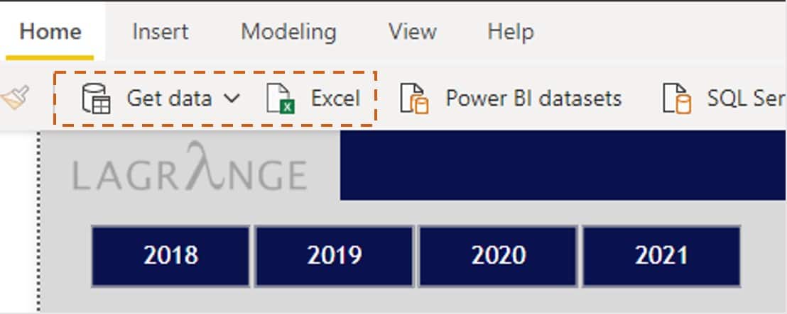
Power BI ribbon where Power Query can connect to 100+ data sources (Excel, Access, SAP, Exchange, Smartsheet, Facebook, etc.)
The Query Editor, also known as Power Query, is where the majority of time is spent prepping and transforming data for analysis. In the Query Editor, you can perform a lot of functions that were usually done in Excel such as:
- Trimming leading and trailing spaces (Text.Trim)
- Concatenate multiple columns to make a unique ID
- Standardizing cost codes to be 6 digits (Text.PadStart)
One useful transformation is filling down rows in the Query Editor. For example, exporting an activity code list like a project-level WBS can be transformed to include each WBS level as a column.
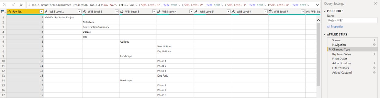
Power Query (Query Editor in Power BI) connected to an Excel file where the WBS activity code table is saved
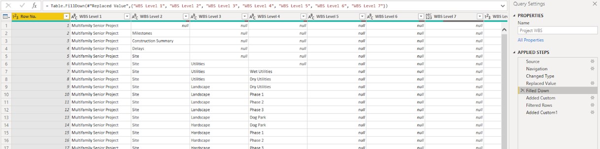
Filled down on each WBS level to re-create the WBS activity code outside of P6
This same process can be repeated for adding more activity codes from P6 and into Power BI. The main benefit is this allows you to slice and dice your schedule data the same way as in P6, but using powerful visuals.
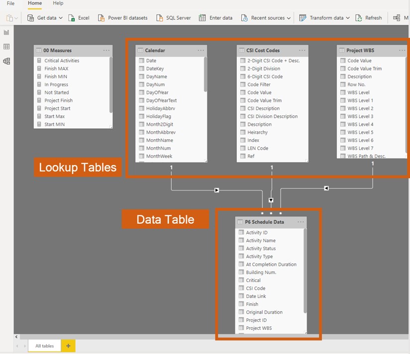
Step 2: Creating relationships between activities and activity codes
The real magic in Power BI is the ability to relate tables to each other – activity codes such as area or subcontractor can be linked to a list of activities.
Bill Jelen, the founder of MrExcel.com, says Power Pivot (the engine for Power BI) is the best new feature to happen to Excel in the last 20 years. Power Pivot takes you from making Pivot Tables in Excel to making dynamic dashboards in Power BI. It supercharges your analysis and allows you to create endless smart formulas.
For this example, we will create relationships between the activities tables and the following “lookup” tables:
- Project WBS
- CSI Cost Codes
- Calendar
One of the great things I learned was from Rob Collie in his book was that filters flow downhill. This was an important concept I learned with how to visually organize lookup tables and data tables, which made data modeling easier to learn with a clean and organized structure.
The relationships created for this dashboard are one-to-many, where the lookup tables contain a column of unique values and the data table contains many instances of the same unique list of values. The relationships for this model include:
- Project WBS – Linked the P6 code value to the [Project WBS] field in the P6 Schedule Data table (data table)
- CSI Cost Codes – Linked the P6 code value to the [CSI Code] activity code field in the P6 Schedule Data table (data table)
Creating these relationships allows you to link datasets together without having to use a VLOOKUP and combine multiple tables. By linking lookup tables to data tables, you can create formulas that compare things like budget vs. actuals, or last month vs. this month.
What took hours or days to produce (what-if analysis for management) can now be reduced to sometimes under an hour.
Step 3: Use the Gantt chart visual and create measures for simple schedule dashboard metrics
After getting the data and creating relationships in a data model, the final (and very fun) piece is to create visuals. The ability to display data and quickly generate insights is very valuable, especially for many in project management.
Some of the visuals in this example schedule dashboard include:
- Gantt chart
- Card
- Slicer
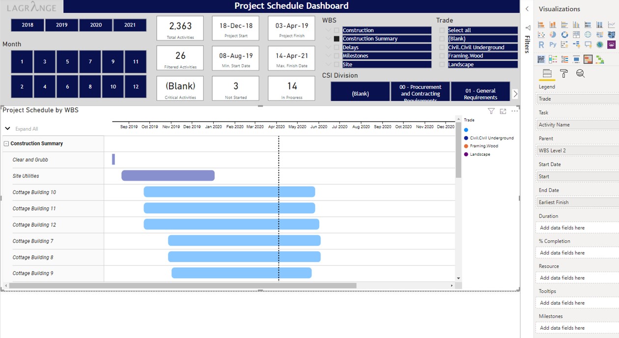
The most common way to view construction schedules is through the use of the Gantt chart, where P6 schedules are generated and emailed to various stakeholders. In Power BI, the same activities can be viewed using a Gantt chart and can be analyzed by various “slicers”.
Slicers are the most common attributes that relate to the data (activities) contained within data tables. For example, activity codes like WBS, Trade, and CSI Code can be used as slicers to dynamically view specific sets of activities. A
few views (layouts) that can be seen in the Gantt chart:
- All “Construction Summary” activities
- All “Construction Summary” activities that are Wood Framing
- All “Division 03 Concrete” activities
- All “Division 03 Concrete” activities for Building West
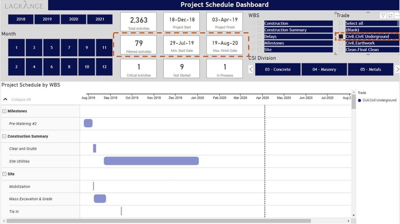
In Power BI, you can slice and dice data in many ways to help you analyze schedules and gain insights. Creating measures (summarizations like sums, averages, counts) allows you to analyze data that changes based on the slicers you select.
For example, I created two measures (Start MIN, Finish MAX) that find the earliest start date and the latest finish date contained in the P6 Schedule Data table. These measures are dynamic and will display different start and finish dates if you select Trade = “Civil Underground” or CSI Division = “05 Metals”.
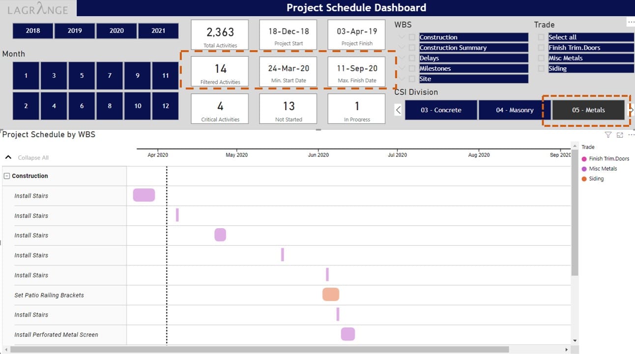
Power BI slicer: 14 activities when clicking on CSI Division = “05 – Metals”
Measures are extremely powerful and allow you to generate insights across a variety of dimensions. Many simple measures can be created to view schedule data from P6 in Power BI:
- Count critical activities
- Count activities for a 3-week look-ahead
- Compare baseline dates to actual dates
Making charts is one of the most fun parts in Power BI and there are many amazing dashboards that you can see from the Power BI community. Creating simple measures to interact with schedule data from P6 is truly powerful and helps everyone quickly identify key metrics.
Conclusion
In this post, we went over how to create a Gantt chart schedule dashboard in Power BI using schedule data from P6. We looked at how to get data from P6, how to create relationships to activity code tables, and how to create measures to summarize data in visuals.
Are your projects or companies using Power BI or another business intelligence tool? What are some of the schedule dashboards you have seen? Please comment below.
Additional Resources/Training:
To have a deep-dive hand-on guide on creating automated Schedule Dashboard, assessing trends & schedule KPIs in your Primavera P6 data without the need for spreadsheets, as well as various methods of obtaining your Primavera P6 data in Power BI (Excel, XML, XER, SQL), be sure to check the highly practical online training organized by Project Control Academy; Power BI Visual Data Analytics for Project Controls.

About the Author, JC Vanbrunt

JC VanBrunt is a Director at Lagrange, a management consulting firm providing project controls and program management services.
JC is responsible for providing data integration and developing reporting capabilities for clients.
Prior to Lagrange, JC was at FTI Consulting as an analyst in the Construction Solutions practice where he worked on construction cost claims and preparing expert witness reports for arbitration and litigation.
JC graduated from the University of Washington with a Business Administration degree focused on Finance and Accounting.
To connect with JC, please check his LinkedIn profile or his personal blog.


![[Free 90-min Masterclass] How to Avoid Project Delays Turning into Costly Claims](https://www.projectcontrolacademy.com/wp-content/uploads/2025/08/September-2025-Webcast-Chris-Carson-H01-Yellow-2048x1152.jpg.webp)
![[Free 90-min Masterclass] The Ultimate Leadership Recipe for Project Professionals](https://www.projectcontrolacademy.com/wp-content/uploads/2024/08/4-2048x1152.jpg.webp)


